HEllo! I'm Hershey 👋🏽
A SENIOR CREATIVE. Art Director. StoryTeller.
AND OCcASiONALLY FUNNY.
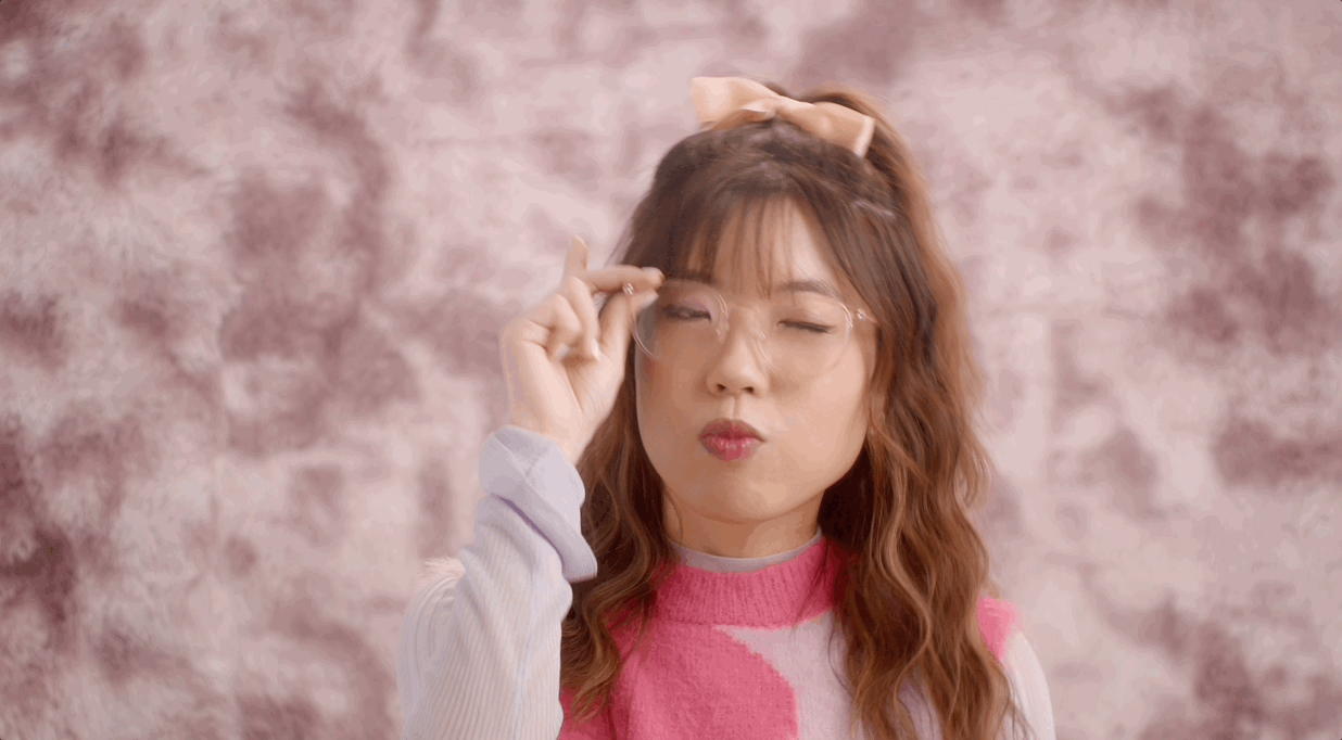

Hello I'm Hershey!
Senior creative. Art director. Storyteller.
And occasionally funny.
Hello I'm Hershey!
Senior creative.
Art director. Storyteller.
And occasionally funny.
Here's what I've been up to lately 👇
Here's what I've been up
to lately 👇

FRAME every you
Lenskart Brand Refresh
FRAME every you
Lenskart Brand Refresh
FRAME every you
Lenskart Brand Refresh
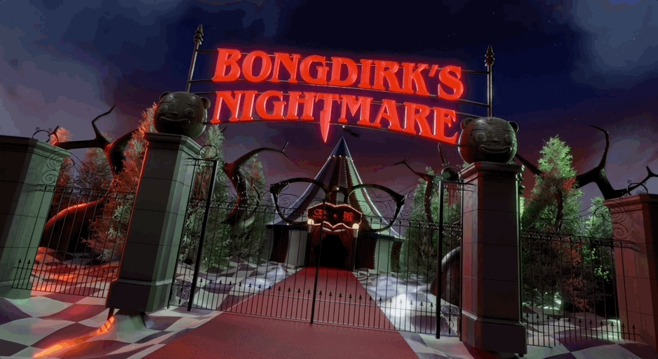
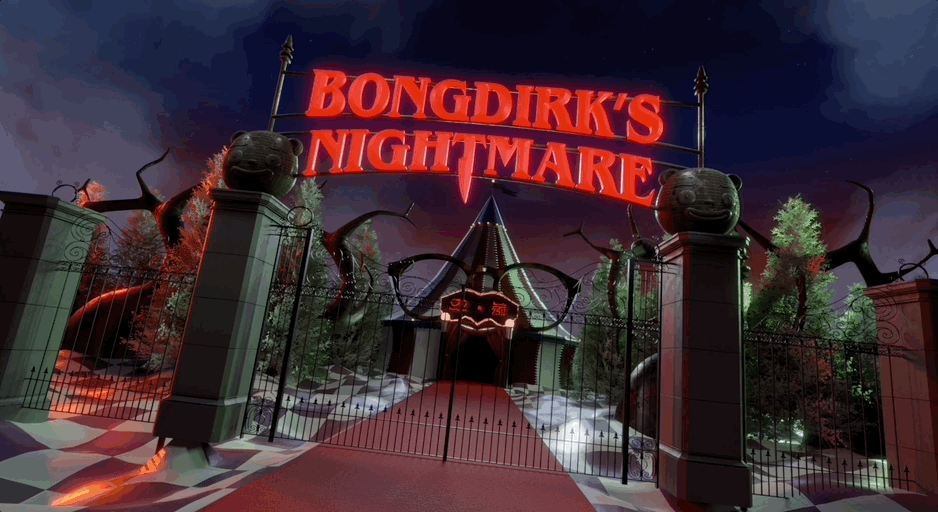
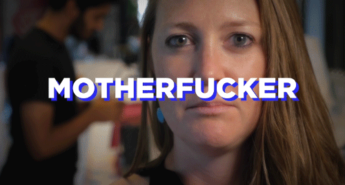
Bongdirk's nightmare
Lenskart
Bongdirk's nightmare
Lenskart
Bongdirk's nightmare
Lenskart
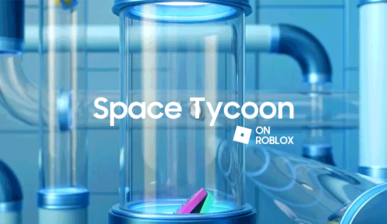
Space tycoon
samsung
Space tycoon
samsung
Space tycoon
samsung

THE REALITY CHECK
Lenskart
THE REALITY CHECK
Lenskart
THE REALITY CHECK
Lenskart

Taste the impact
Re- Foods Olam
Taste the impact
Re- Foods Olam
Taste the impact
Re- Foods Olam
Laser cat 3000
bandai namco
Laser cat 3000
bandai namco
Laser cat 3000
bandai namco
Mind your word
personal project
Mind your word
personal project
Mind your word
personal project

We got this
WWF
We got this
WWF
We got this
WWF
© Harshmeet Kohli 2024
© Harshmeet Kohli 2024
© Harshmeet Kohli 2024